Now InLinks can create categorized Knowledge Graphs of entire websites with just a few clicks. This is an enhancement to the Topic Maps launched in December which show missing topics in content at the page level. The Knowledge Graph crawls as many pages on your site as you ask us to (With the first 20 pages for free). It then uses our own NLP analyzer to map out the content sitewide and categorizes the content by vertical and also uses Google’s NLP to see where Google is falling short.
Knowledge Graphs Organized by Category, not Menu structure
Knowledge Graphing is a process which can really help you to communicate much more effectively to targeted audiences. If you target different personas with different messaging, the knowledge Graphing process can also help you to finesse the content marketing between different audiences. In normal circumstances, such variations around content themes can result in cannibalization, but combined with Inlinks’ internal link automation, the cannibalization is resolved as search engines receive constant signals indicating which page is the main cornerstone content for any topic when viewed independently of these personas.
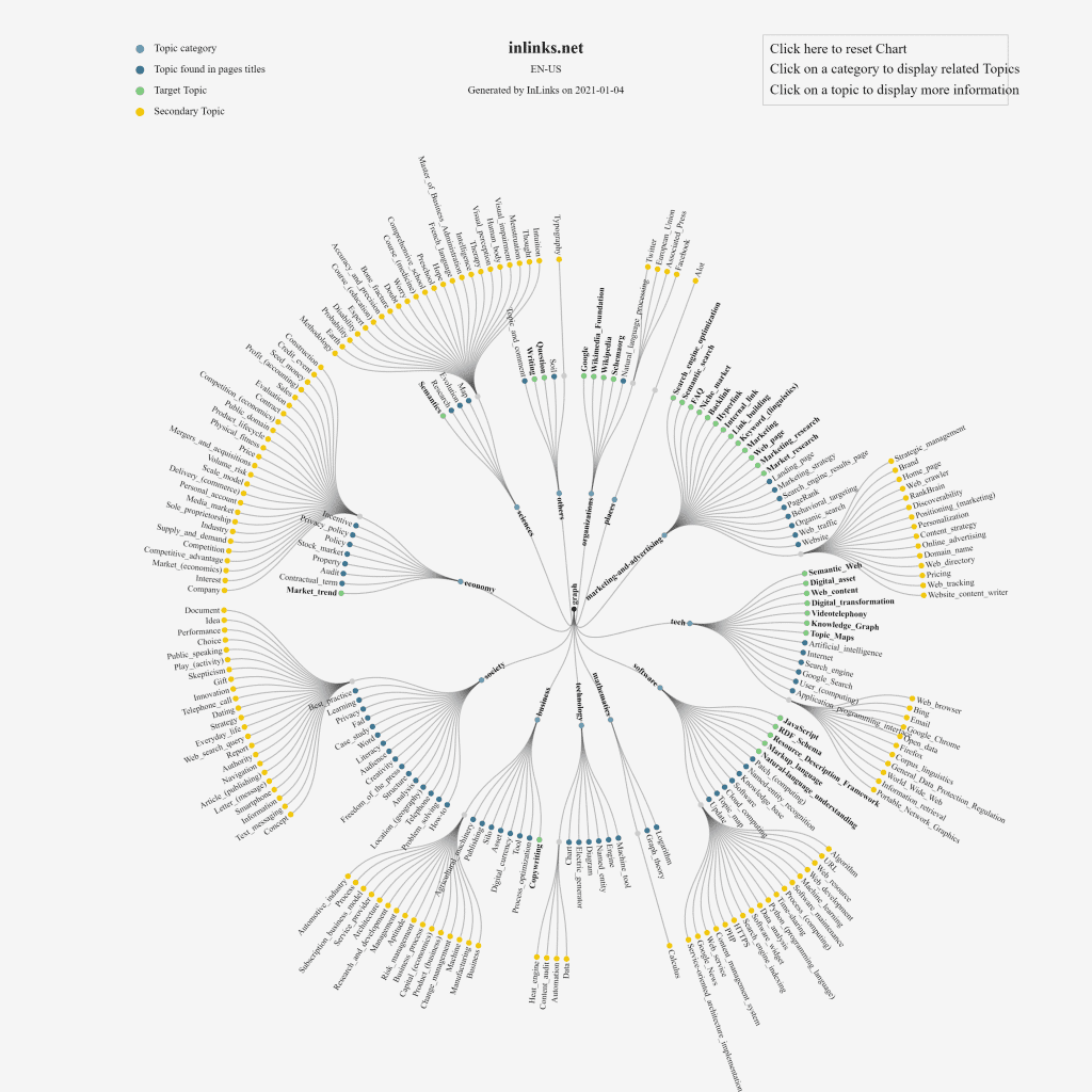
Let us zoom into one of the Knowledge Graphing charts and look at the categorization. In the example below, we are drilling into the Knowledge Graph currently created from Inlinks.net itself. Within this, we have topics discussed on the site which we categorize as being in the “Marketing and Advertising” category. I will explain the colour codings below, but the interesting idea here is that we can now easily see if the customer audience interested in “Marketing and Advertising” is being fed content around the right sorts of messages for our product.
On the whole, I am quite pleased here. The topics are relatively targeted. However, I can do better. The first thing I can do is use the colour coding to see where I have missed talking about topics in page titles and I can also separate out primary topics from secondary topics.
Interactive Knowledge Graphs
The second thing I can do here is to drill into the text for each topic and see WHICH PAGES mention each topic. From here I can also select the page which should be my cornerstone content. In doing so, I let the full power of InLInks swing into action, as the system generates or modifies content schema and injects the new schema directly into the web page. Then Inlinks looks for the relevant anchor text for all the other mentions of the topic and builds internal links, automatically injecting the links directly into each page on your site.
Powerful stuff, I think you’ll agree?
Problems and Pain Points that contents that the Knowledge Graph Charts address
- For the first time ever, you can see at a site level, the differences between entities that Google reports and Entities that Google misses.
- See what topics are and aren’t discussed sitewide
- This interactive map also makes it much easier to make the page associations than before
- The colour coding is great for users that prefer visual cues to the text-based topic lists already used by InLinks
1: See the differences between Entities that Google reports and Entities that Google misses
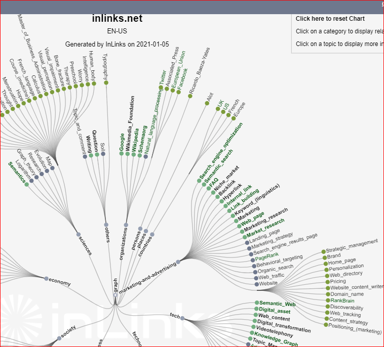
When we build the Knowledge Graph, we actually run now one, but TWO NLP Algorithms over the content. The first is our own NLP API, which is extremely effective at surfacing entities or topics in content. The second is Google’s NLP API which does not report entities unless they are more confident that they are relevant to the content. (The difference gives a Search Engine Understanding or SEU score.) This is the first time that any tool, as far as I know, has been able to demonstrably show what entities Google COULD pick up but ISN’T at a sitewide level! To denote this, we have put the text of all topics that Google DOES report in Green. We can see a marked difference between well-written SEO content and not so well written content. Let’s look at Moz vs InLinks. The Moz content is simply BETTER than ours, right now. We are working on that!
2: See what topics are and aren’t discussed sitewide
It is often difficult to see what topics are and aren’t discussed on a website. But it is MUCH harder to see what topics might be important in the text of a website, which has never appeared in a page title. It is also hard to then easily connect a topic with the underlying pages talking about the content. It might be easy page by page, but Google has stated its intent to move toward passage indexing. I understand this to mean that Google will start to understand that a page of content can have multiple areas of content and each section might be distinct. It could be possible that one section of the content on a page is highly authoritative in regards to a very narrow topic area, but unless Google separates that passage from the rest of the page, it is difficult to give that content prominence at the right time. Prior to passage indexing, Google does seem to highlight snippets of content within a page, but I expect this to be much more powerful as a ranking factor when passage indexing rolls out.
3: The Interactive map also makes it much easier to make the page associations than before.
4: The colour coding is great for users that prefer visual cues
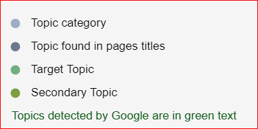
The topics in the Knowledge Graph are organised into categories, like!”science” or “economy”. The categories are denoted with a grey/light blue circle. The Dark Blue circles show topics found in the page titles of content. The Green “Target Topic” shows topics which you have associated with a cornerstone page on your site. YOUR MOST IMPORTANT TOPICS SHOULD BE IN GREEN. The secondary topics are in yellow and are generally less important.
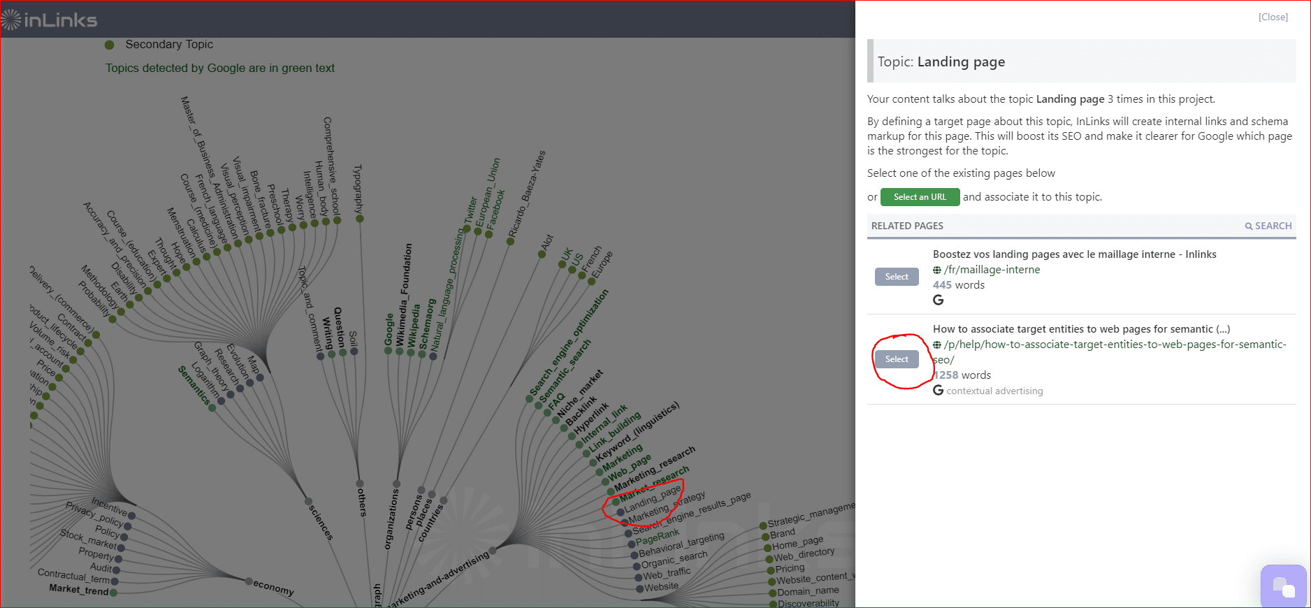
Click on the text of a blue topic to associate it to a landing page
There is one other visual cue, which is that the TEXT of topics which are also picked out by Google is in green. So a PERFECT web optimization will not only have the most important topics with Green dots but also green text. We cannot force Google to recognize the topics, but we do automate the schema to make a strong suggestion for Google to consider. So to turn a BLUE topic to a green dot, click on the text of the topic and assign it to a page. Be a little careful not to just associate everything though… your site should be skewed towards one or two categories most of the time.
Knowledge Graphing & Content Marketing
Of course, mapping your content is a great precursor to Content Marketing. I recall, back in my own SEO Consultancy days, that we would roll out a recommended Content strategy which used keyword volumes and keyword difficulty metrics to find the low hanging fruit. Back in those days. however, there were no tools that I can recall which highlighted which of these content ideas had ALREADY been written (probably by the previous SEO Consultancy!). Knowing this, or being able to see these existing topics quickly and visually can help to focus on NEW content that needs writing and EXISTING content that needs auditing.
Build out Target Audiences
The audience for a topic in one context can be interested in very different content than audiences in a different market segment. Most websites structure their content around the site navigation, which can be problematic as the customer journey is often different. This way of mapping the content opens up an opportunity for new strategies for content, which can be based much more around the customer’s own ecosystem. For example, in creating this page, I notice from our content audit tool that the SERPs are orientated around the “Marketing and Advertising” category, although the “biggest” topics are around business and society.
How to find or build a Knowledge Graph
It is extremely easy to find these graphs or make your own. If you already have a project on InLinks.net, click on the “Graph” button and then on “Knowledge Graph”. It will already be built. However, please bear in mind that the chart is only built from the pages added into the project. If you want a deeper view and a richer knowledge graph, simply add more pages into the project. You can build graphs for up to 20 pages for free, but the examples in this post have had nearer 280-200 pages crawled and analyzed.
Cool 🙂
Sounds promising. I should give it a shot.
It seems great. I would like to do it for my website.
Is this only used for English only?
Currently English, French and Spanish. we are working on Polish, but it is hard!
Very interesting, I was looking how to produce high quality graphs representing content clusters that helps visualising this information. I will try this tool to see if it suits our purposes. Thanks for producing this content.
Very interesting
Leave a Reply
Want to join the discussion?Feel free to contribute!